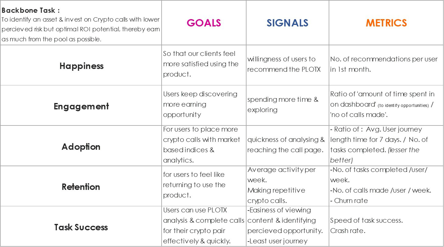
Objective
Identify usability roadblocks to existing design (https://plotx.io/market) and redesign the dashboard page to achieve effective Metrics under 'HEART' framework.
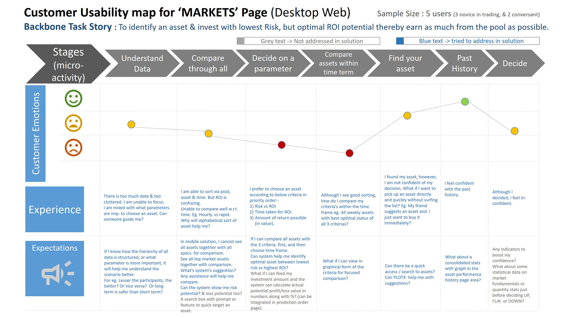
Existing Design
Design Considerations
• Android OS for mobiles, Web APP for desktop.
• Users considered are Indian office going middle class, middle-age male with – (1 novice to trading, 2 conversant with crypto & stocks).
• Focus was only on the ‘MARKETS’ page. All other data (breadcrumb/headers) of other pages are just placeholders. • GUI factors like Color palette are not a part of this assignment proposal. Dark theme considered for this assignment without much contemplation.
• The size, locations & color of visual elements may not be precise as this is a med. Fid. Proto for UX research purposes.
Design Criteria:
The synergy of mental models and UI design language between mobile design & desktop design. A solution that can improve the efficiency of the backbone task of the user by using metrics as foll :-
Qualitative :
How much mental strain caused for the user to achieve the task?
Any decrease in cognitive loads? Especially recurring elements/actions.
CSAT score after investment (factors like user confidence & user convenience as focus).
Quantitative :
The least time is taken to complete the task.
Least no. of user actions required to complete the task.

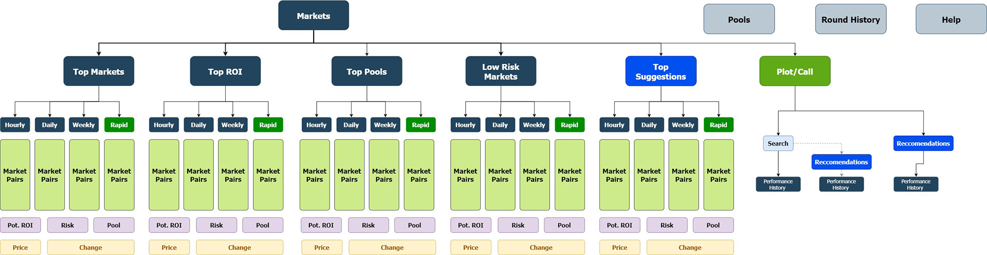
Existing Design vs Proposed Design
--------------------------------------------------------------------------------------------------------------------------------------------------------------------------
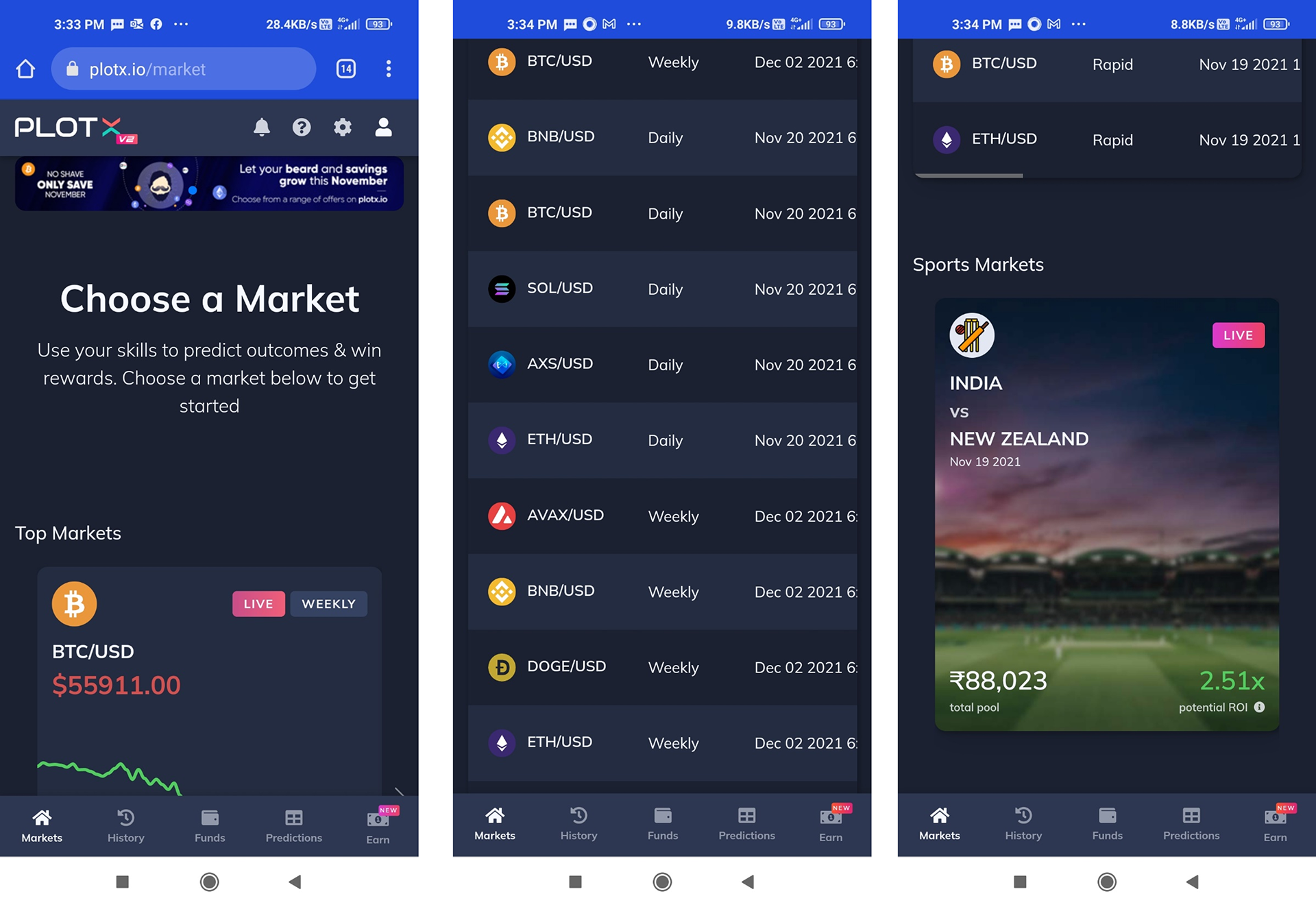
Part 2 : Mobile App
Existing
Proposed Design
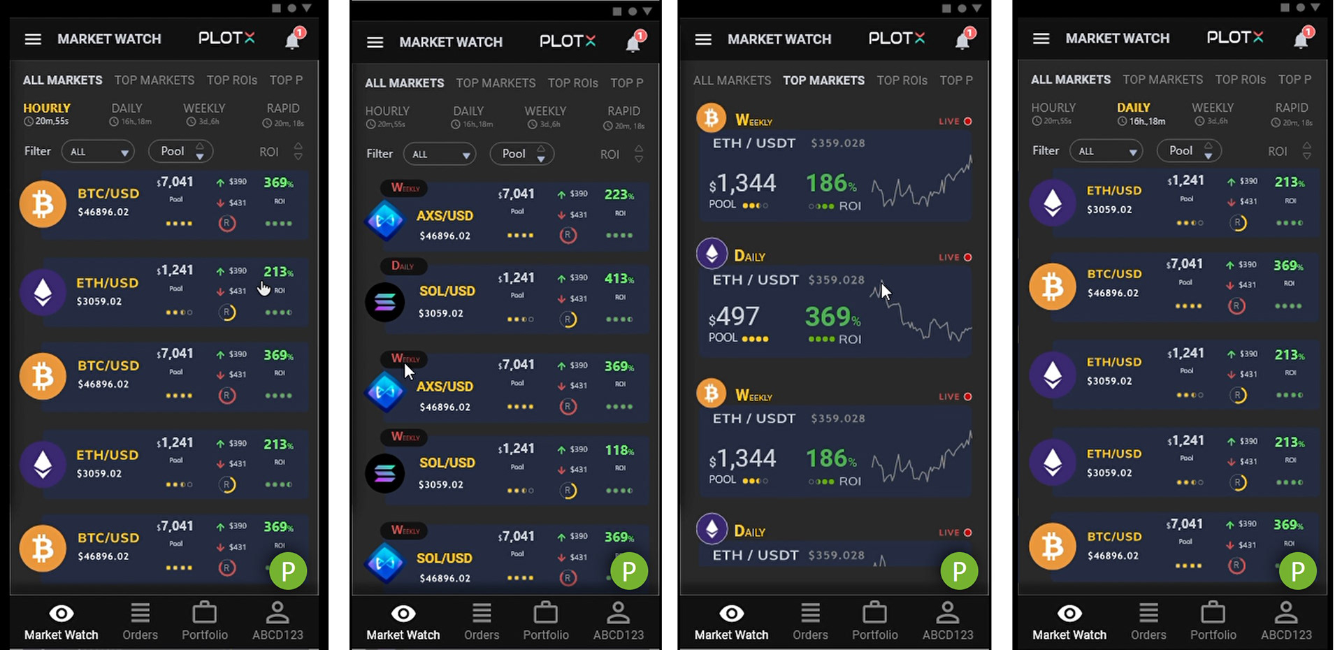
Clickable med-fid. Proto
What's Resolved? What’s Improved?
1) Information hierarchy, and hierarchy of elements
Hierarchy of elements followed:-
Hierarchy of elements followed:-
- what's most intense?
- what's most frequent?
- what's most convenient?
- what's most frequent?
- what's most convenient?
Accordingly, we locate the navigation hierarchy, as well as graphic handles like color, typography & contrast.
2) Navigation & scroll locks
3) Design for de-clutter or design for 'focus zones’.
4) Usability features to support mental model attributes... like
- I need focus!
- can I see all?
- can I see all as well as focus on my interest?
- I understand the potential ROI, but, what's the risk potential?
- I don't want to see so much... I know what I want... I want to quick predict
- before I quick predict, I need confirmatory historic analytics to boost confidence.
- can technology help me with intelligent recommendations?
Notes :
Navigation panes should help users understand the criteria of decisions & information hierarchy. -this will decrease mental chaos.
Why do I need alphabetical sorting?
Placebo features can help for User to feel in control.
Why a non-clickable 'predict' button icon within the complete clickable bar? It confuses user.